


|
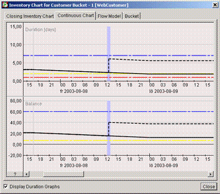
Continuous Chart
The continuous chart estimates the inventory level or backlog at any given point during the coming week.
The upper graph (1) shows the duration (run-out time) of the inventory, and is only shown if the Display Duration Graphs checkbox (4) is checked.
The lower graph (2) shows the balance (quantity).
The dotted line shows the inventory levels with the suggestion included.
The Opening Stock Level is the starting point for the Continuous Chart.
If you’ve opened the graph from a delivery suggestion or a delivery, the time of the currently chosen delivery (suggestion) is shown as a blue area in the background of the chart.
Inventory Chart: the Continuous Chart
tab.
If you click on the question mark, you open a graph legend – a dialog box with explanations of the color symbols in the Continuous Chart.
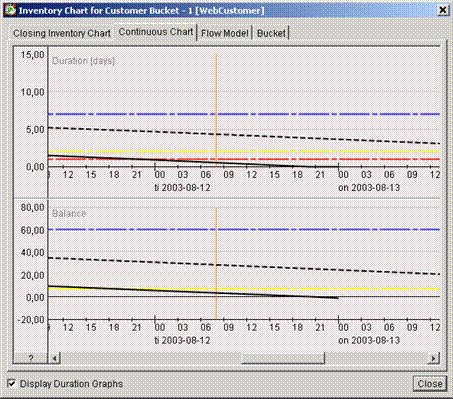
This orange line marks the End of the Inventory Analysis. The End of Inventory Analysis limit is set to the moment immediately prior to the last reception time of the first shipment that is just outside of the Confirmation Margin – in this scenario. However, a manually confirmed shipment’s reception time will push the End of Inventory Analysis limit further into the future.
To see the precise level and time of any point on the graph, just place the mouse cursor over that point. Two crossed white lines help you keep track of where you are, and the exact values are shown in white text over a darker gray background. See image below.
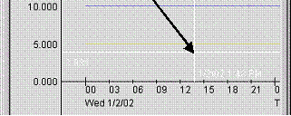
Figure 4. Inventory Chart: Viewing precise values
(in white)