

|
Begin Creating Reports
We will now show you how to start creating reports in Microsoft Excel using the information in the Supply Inventory cube.
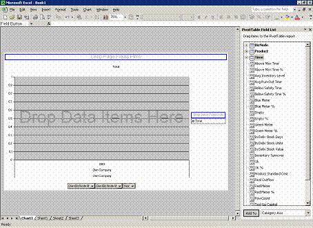
The pivot table is shown in two ways: as a graph (in the worksheet called Chart1 in the illustration) and numerically (in the worksheet called Sheet1 in the illustration). The illustration above shows the graphic display (Chart1).
To the right in the screen, you can see a list of data items: dimensions and measures. To use these in the chart, simply drag and drop them onto the chart. This works in the same way whether you are in the graphic display or the numerical one (Sheet1). Changes in Sheet1 affect Chart1 as well, and vice versa.
You can connect other sheets in the Workbook to connect to other cubes or to the same cube with other data selection.
Begin by choosing the dimensions you want, e.g. Product and Time. Use the mouse to pick them up in the list on the right and drop them on the graph.
Next, choose the measures you want to use (such as OK %) and drop them on the graph as well.

The result can be displayed at different levels of detail. Which level you choose is up to you; it may depend on what you want to analyze.
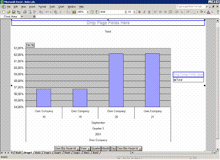
You can “drill down” or “up”, meaning that you choose to go to a more detailed (“drill down”) or more summarized (“drill up”) level of a dimension. In the previous illustration we have chosen the Time dimension, and the level is Year. The chart shows OK % (i.e. the service level) for all products during the year 2001.
The illustration below shows what happens if you “drill down” to the Day level of the Time dimension. The chart shows OK % (i.e. the service level) for all products per day for a four-day period during that year.