


|
The Management Dashboard
In the PipeChain Client
The Management Dashboard screen provides overview/monitoring in a flexible way. It consists of an arbitrary number of predefined dashboard views, selected from a drop-down menu. These can be positioned above, below, right of, left of or on top of other views.
Any screen layout can be saved to a Named View in the same manner as overview screens. Such a named view may be shared by several users. In addition to this, changes are also automatically saved per PipeChain User, which means that the screen will look the same the next time that user logs in.
In the Web Supplier Client
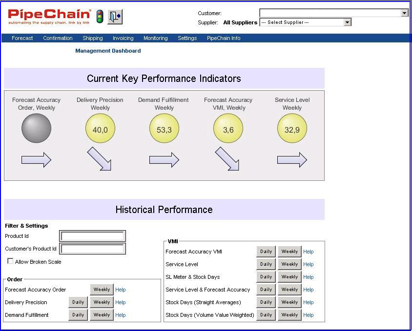
The Management Dashboard screen shows a fixed row of KPIs (values plus trends) and contains buttons for displaying corresponding graphs in individual windows.
It is useful for both traditional order management (TOM) as well as vendor managed inventory (VMI) KPIs.
The available TOM KPIs and graphs are Forecast Accuracy Order, Delivery Precision and Demand Fulfillment (se below for details). Note that only one of Delivery Precision First Confirmed (FC)/Last Confirmed (LC) is presented, and that a Selected Property controls which one.
The available VMI KPIs and graphs are Forecast Accuracy VMI, Service Level and Stock Days (with straight or volume value weighted averages) as well as the combination graphs (see below for details).
The screen also contains some settings for the graphs; allowing "broken scale" for improved resolution and filtering on a product id (with wildcard).
In the Web Customer Client
The Management Dashboard screen shows a fixed row of KPIs (values plus trends) and contains buttons for displaying corresponding graphs in individual windows.
It is only useful for vendor managed inventory (VMI) KPIs.
The available VMI KPIs and graphs are Forecast Accuracy VMI, Service Level, Stock Value and Stock Days (with straight or volume value weighted averages) as well as the combination graphs (see below for details).
The screen also contains some settings for the graphs; allowing "broken scale" for improved resolution and filtering on a product id (with wildcard).
Availability of Data
All "Management" views (but not "General" or "Administrative" views) contain historical data, saved to and retrieved from PipeChain Analyzer. Thus they require that PipeChain Analyzer is installed. Note that the OLAP processing trigger mechanism is also necessary to make Analyzer data available. This setup is described here.
The analyzer background jobs are normally run at night, making values up to yesterday available in the morning.
It is possible that no data is available for a certain dashboard view. In graphs this shows as absence of data. In KPIs (Key Performance Indicators) this shows as a grey object. In both cases, the tool tip will write No Data in stead of data values.
Using the PipeChain Filter Settings
Most views in the Dashboard are affected by the PipeChain Filter Settings Supplier Id, Supplier Group, Customer Id, Customer Group, Product Id and Product Group.
Many views (Service Level, Forecast Accuracy VMI, Stock) are also affected by the PipeChain Filter Setting for SMI, while the Delivery Precision/Demand Fulfillment views are affected by the PipeChain Filter Setting for Delivery Type.
The Web Client Dashboard screens implement parts of the PipeChain Filter, i.e. Product Id, Supplier Id and Customer Id.
Editing the Dashboard
New views are added with the drop down menu Show View.
You position a dashboard view by clicking its tab and dragging it. A shadow appears were the view would be positioned, if released. The position is always relative to one of the already present views. The possible positions are - and the cursor should be positioned at
-
above - at the absolute top of the view, above the tabs
-
below - at the lower 25% of the view
-
right of - at the right 25% of the view, but not at the very top or bottom
-
left of - at the left 25% of the view, but not at the very top or bottom
-
in the same panel, with tab positioned last - at the center of the view OR at the top of the view after the tabs
-
in the same panel, with tab positioned before - on an already present tab
The Dashboard Views
Most of the predefined views are management (performance) oriented, but views may also be general, operative or administrative.
Views provide a tool-tip with additional information when the cursor is positioned
-
on the tab
-
on an object in the view
-
on a time slot in a graph. Note that the displayed data refers to the selected time slot, not the time slot closest to the cursor
Views also provide a pop-up menu where the view can be closed or altered.
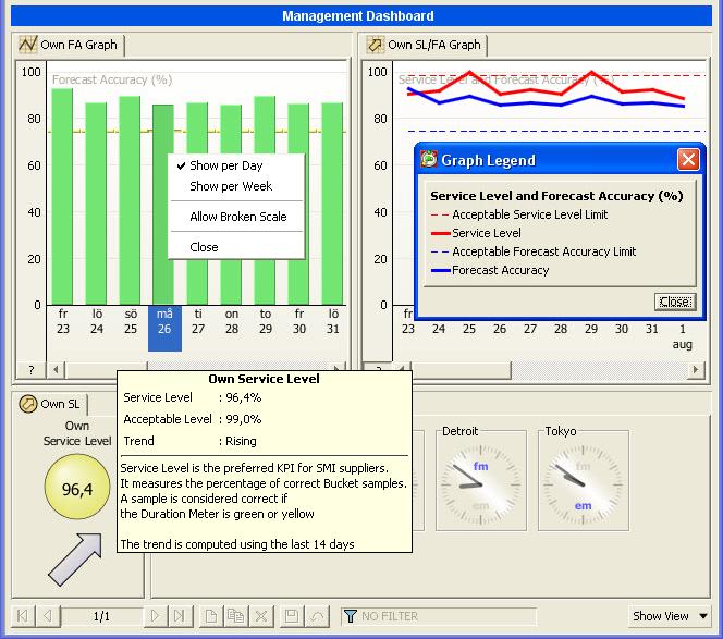
Graphs provide a legend, by clicking the ?-button at the lower left.
General Views
The Global Time view aims to provide an overview of the local time of your main sites, suppliers and customers. You add or remove a clock using the view's pop-up menu where you specify the caption and the time zone.
The HotSpot view aims to highlight aspects of the system that needs to be addressed, either for direct action or to keep a watchful eye on.
The view lists a number of categories, where each category is marked with a colored icon, indicating its severity. Red icon categories are listed first. A yellow icon indicates a weaker severity. Green categories are purely informational, and are listed last. Each category, lists a number of items. These items may have icons, indicating their individual severity.
HotSpot categories:
Night
Jobs at this Site lists when the Night
Jobs have run for the last five days on the current Site. Each item has
a severity icon, Red if the
night jobs haven't run at all, Yellow if
the night jobs started later than scheduled (a tool tip explains when
they should have started), Green if
the night jobs started on time.
Double-click on an item to go to the Background
Job Statistics screen, with a preset filter that locates the Night
Jobs for the day in question.
Night Jobs at other Sites is available only when you have access to more than one Site, and the client is set to display data from all Sites in the Business. There is an item for each Site that describes when the Night Jobs have run today. Icon colors are the same as for Night Jobs at this Site. Double-click on an item to go to the Background Job Statistics screen, with a preset filter that locates the Night Jobs for the day in question.
Currently viewed Sites lists the Sites data for all Dashboard views are gathered from. It reflects the setting of the Business/Single Site selector.
Management Views
Management views show KPIs that are primarily stored in PipeChain Analyzer. More details of the KPIs are found in the Analyzer documentation, detailed information is also available online in the dashboard views - as tool tips. For more information of the above Analyzer KPI's, see Analyzer documentation.
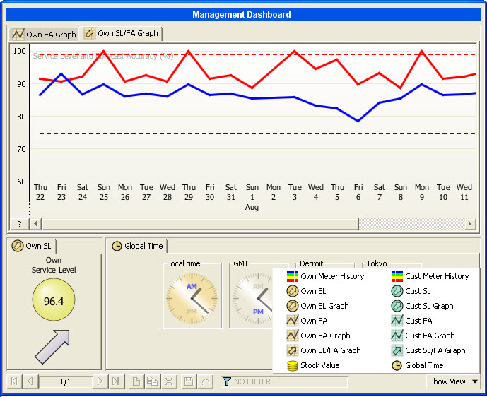
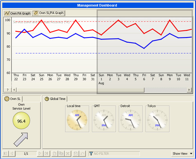
The Own SL view shows the most recent inbound Service Level KPI value and trend. There is also a Cust SL that provides the same information for the outbound side. Resolution is week or day. The trend range, the Service Level logic and the color change limit are controlled by Selected Properties.
The Own SL Graph view shows a graph of the inbound Service Level KPI. There is also a Cust SL Graph that provides the same information for the outbound side. Resolution is week or day. The graph range, the Service Level logic and the color change limit are controlled by Selected Properties.
The Own Meter History view shows a graph of the inbound PipeChain Supply Duration Meter situation and how it correlates to Stock Days. This enables the user to monitor both "red" and "blue" problems over time. There is also a Cust Meter History that provides the same information for outbound PipeChain Supply Duration Meters and Stock Days. Resolution is week or day. The graph range is controlled by a Selected Property.
The Forecast Accuracy KPIs share many common features. Accuracy is in the range 0-100% and is computed as 1 - min (1, abs (forecast-real outcome) / forecast). If forecast equals zero, division is not possible. Accuracy will then be 100% if real outcome also equals zero, else accuracy will be 0%. Accuracy can be regarded as the "primary" KPI, and for each Accuracy there is a corresponding "secondary" BIAS. Especially when Accuracy is low, it is valuable to see if forecast is generally too high (positive bias) or too low (negative bias).
The Own FA VMI view shows the most recent
inbound Forecast Accuracy VMI KPI value and trend. There is also a Cust FA VMI that provides the same
information for the outbound side. A pop-up menu controls if daily or
weekly Forecast Accuracy is shown. Note that this is not only a resolution
change, it is also a "forecast offset" change.
Daily Forecast Accuracy VMI always compares the latest computed "daily
real outflow" to what was forecasted (lead time + confirmation margin)
ago.
Weekly Forecastl Accuracy VMI compares the latest computed "weekly
real outflow" to what was forecasted (as Flow Models) a parameterizable
weekly offset ago, controlled by a "Selected Property". The
trend ranges (day and week) and the color change limit are also controlled
by Selected Properties.
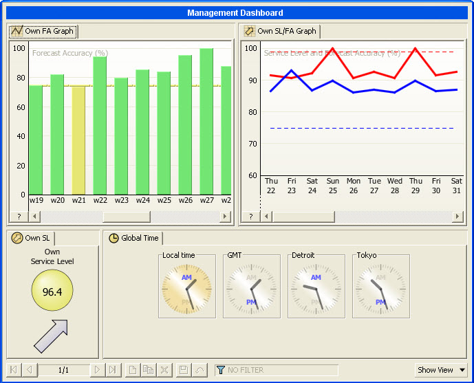
The Own FA VMI Graph view shows a graph of the inbound Forecast Accuracy VMI KPI. There is also a Cust FA VMI Graph that provides the same information for the outbound side. A pop-up menu controls if daily or weekly Forecast Accuracy is shown (and the offset, see above). The graph ranges (day and week), color change limit and the "weekly offset" is controlled by Selected Properties.
The Own SL/FA Graph view shows how the inbound Service Level and Forecast Accuracy VMI KPIs correlate. There is also a Cust SL/FA Graph that provides the same information for the outbound side. The resolution is week or one day. Note that in this view, this is ONLY a resolution change. The graph range is the maximum of the Service Level graph range and the Forecast Accuracy VMI graph range.
The Own FA Order view shows the most
recent inbound Delivery Schedule (Forecast) Accuracy KPI value and trend.
There is also a Cust FA Order
that provides the same information for the outbound side. A pop-up menu
controls if daily or weekly Forecast Accuracy is shown. Note that
this is not only a resolution change, it is also a "forecast offset"
change.
Forecast Accuracy Order compares the latest computed "daily/weekly
real demand" to what was forecasted (as Delivery Schedule) a parameterizable
daily/weekly offset ago, controlled by two "Selected Properties"
(daily and weekly resp.). The trend range and the color change limit is
also controlled by Selected Properties.
The Own FA Order Graph view shows a graph of the inbound Forecast Accuracy Order KPI. There is also a Cust FA Order Graph that provides the same information for the outbound side. A pop-up menu controls if daily or weekly Forecast Accuracy is shown (and the offset, see above). The graph ranges (day and week), the color change limit and the "daily/weekly offset" is controlled by Selected Properties.
The Stock Value view shows a graph of the own Stock Value. The measure is computed as a sum of the products selected by your current filter setting. A pop-up menu controls if customers' Stock Value is displayed on top of own Stock Value, and if all products or only Active products will be displayed. The Stock Value measure require that a standard cost is defined per product, if not the computation will yield a zero result. The graph resolution is week or day. The graph range is controlled by a Selected Property.
The Stock Units view shows a graph of the own Stock by number. The measure is computed as a sum of the products selected by your current filter setting, thus it is mainly useful when looking at a certain product or product group. A pop-up menu controls if customers' Stock Units is displayed on top of own Stock Units, and if all products or only Active products will be displayed. The graph resolution is week or day. The graph range is controlled by a Selected Property.
The Stock Days view shows a graph of how long the own Stock will last, given the expected outflow. The measure is computed as an average of the products selected by your current filter setting. A pop-up menu controls if customers' Stock Days is displayed in front of own Stock Days. Note that these two measures cannot generally be added. The view displays only Active products, since inactive products would ruin the averages. You may choose if 'straight' averages or 'volume value weighted' averages are used. Volume value weighted averages provide better figures, but require that a volume value (or volume and standard cost) is defined per product, if not the computation will yield a zero result. The graph resolution is week or day. The graph range is controlled by a Selected Property.
The three Dmd Fulfillment and Delivery Precision KPIs compare either Demand, First Confirmed or Last Confirmed data with "delivered" data."Delivered" refers to either "Shipped" or "Received" depending on the supplier's responsibility (Terms of Delivery). Comparison is made for quantity and date. All measurements are made per delivery (order line), and the Deviation Limit settings control if a delivery is OK or not. Price is not included in the comparison.
The Own Dmd Fulfillment view shows the most recent inbound Demand Fulfillment KPI value and trend (Demand quantity and date vs Delivered quantity and date). There is also a Cust Dmd Fulfillment that provides the same information for the outbound side. Resolution is week or day. The trend range and the color change limit are controlled by Selected Properties.
The Own Dmd Fulfillment Graph view shows a graph of the inbound Demand Fulfillment KPI. There is also a Cust Dmd Fulfillment Graph that provides the same information for the outbound side. Resolution is week or day. The graph range and the color change limit are controlled by Selected Properties.
The Own Delivery Precision (LC) view shows the most recent inbound Delivery Precision (Last Confirmed) KPI value and trend (Last confirmed quantity and date vs Delivered quantity and date). There is also a Cust Delivery Precision (LC) that provides the same information for the outbound side. Resolution is week or day. The trend range and the color change limit are controlled by Selected Properties.
The Own Delivery Precision (LC) Graph view shows a graph of the inbound Delivery Precision (Last Confirmed) KPI. There is also a Cust Delivery Precision (LC) Graph that provides the same information for the outbound side. Resolution is week or day. The graph range and the color change limit are controlled by Selected Properties.
The Own Delivery Precision (FC) view shows the most recent inbound Delivery Precision (First Confirmed) KPI value and trend (First confirmed quantity and date vs Delivered quantity and date). There is also a Cust Delivery Precision (FC) that provides the same information for the outbound side. Resolution is week or day. The trend range and the color change limit are controlled by Selected Properties.
The Own Delivery Precision (FC) Graph view shows a graph of the inbound Delivery Precision (First Confirmed) KPI. There is also a Cust Delivery Precision (FC) Graph that provides the same information for the outbound side. Resolution is week or day. The graph range and the color change limit are controlled by Selected Properties.
Administrative views
The Background Job Throughput view is designed to give a quick overview on how much stress Background Jobs put on the system load. The graph displays how many Background Jobs has been Pended, Started and Finished per time slot. The Display Options dialog, that is launched from the view's pop-up menu, provides a number of options for fine tuning the view. Double-click the graph to go to the Background Job Statistics screen, with a filter preset according to the view's display options and clicked slot.
The MACom Throughput view aims to visualize MACom activity as a function of time. Each time slot of the graph displays the number of registered and the number of successfully processed transactions in that slot. Please note that the graph displays only inbound, successfully processed transactions. The Display Options dialog, that is launched from the view's pop-up menu, provides a number of options for fine tuning the view. Double-click the graph to go to MACom Transaction Overview screen, with a filter preset to display the transactions that make up the clicked slot.
The MACom Processing Time view is intended to find bottlenecks in the processing of inbound MACom transactions. Each time slot in the graph summarizes time that transactions received in that slot has spent in various steps of its processing. The Display Options dialog, that is launched from the view's pop-up menu, provides a number of options for fine tuning the view. Double-click the graph to go to MACom Transaction Overview screen, with a filter preset to display the transactions that make up the clicked slot.
Changing Dashboard View Parameters
Some operator controlled parameters are available on a dashboard view pop-up menu. Other parameters are aimed at the system administrator, and are normally set only once. These parameters are managed in the "Selected Properties" screen. To go the selected properties documentation, click here.
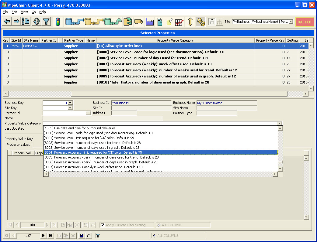
To change a default value you
-
create a new selected property
-
select the Business Key of your business
-
leave the Site Key blank (because the property applies to all sites of the business)
-
you may select a Partner Type if you require different settings for the supplier vs customer side
-
leave the Partner Id blank
-
select the Property Value Category (listed above)
-
leave Property Value Key blank
-
write the desired value in Setting
To change a non-default value, you just edit it in the Setting column.
Note that the value of Setting is NOT validity checked. If a value is invalid, the default value will be used. Valid values are
-
[0-3] for the Service Level logic.
0 means "green or yellow is ok", 1 means "green, yellow or blue is ok", 2 means "green or blue is ok", 3 means "everything but empty is ok". -
[50-100] (%) for all OK limits
-
[1-52] (weeks) for all Forecast Accuracy VMI/Order weekly trend or graph periods
-
[0, 1, 2, 3, 4, 9, 13, 26, 39, 52] for Forecast Accuracy VMI/Order week offsets
-
[0, 1, 2, 3, 4, 5, 6] for Forecast Accuracy Order day offsets
-
[1-100/365] (days) for all daily trend or graph periods. All these except "Forecast Accuracy VMI daily" can be displayed with either day or week resolution although the data is saved per day. The displayed number of weeks is 1/7 of the displayed number of days, however if the setting exceeds 100 only the weekly resolution is affected, the displayed number of days will be limited to 100.